Modern architecture gone terribly wrong.
One of the arguments that fans of modern architecture use is that "traditional" (and by traditional, they almost invariably mean "victorian") architecture is too cluttered, too ugly, too busy, and just plain boring (the last is somewhat amusing, because many of the designs they like are rectangular boxes, which have to be saved from tedium by working the building surfaces with color or designs.) These are compelling arguments -- I am easily seduced by good modern architecture, but there are times when I suspect that some "modern" architects are trying, successfully, to make fools out of the class of people who have too much money to hire an architect who knows what they're doing.
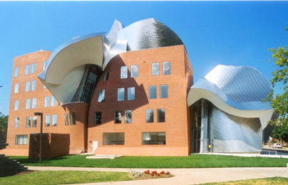
Despite appearances, I have not proven the existance of extraterrestrial intelligence by publishing a snapshot of an barkingly ugly modern building that has just had a spaceship crash into it. No, this is a Frank Gehry building, and it was built that way.
The hardest thing about critising this terrible piece of architecture is trying to figure out where to start. As far as I can tell, there is nothing going for this building, from the repellently boring design of the brick box that is the main building (I've seen Walmart stores that are more attractive than this) to the existance of the Gehry-trademark wavy bits of metal that are festooned around and through the brick box. And, of course, as befits the form-a-long-ways-before-function tendency of modern architecture to place square boxes into environments where they don't fit, it's got the traditional flat roof so the drip buckets in the janitor's closet won't go to waste when the snow starts to melt in the spring, and the snow will be melting in the spring because this building is in Cleveland, Ohio, where it snows in the winter.
And the windows don't open. I can understand why they'd do this, because if I was forced to study or work in a building like this, an openable window would be an almost irresistable temptation to throw myself out of it just to escape the hideous building.
Comments
Well, you might notice that I didn’t call it ‘Modernist’ architecture (whatever that is…. <clickity click> … though if you look at some architects who are mentioned as ‘Modernist’ – Eero Saarinen comes immediately to mind – you can get a pretty good idea of what this monstrosity has evolved from. The TWA terminal at Kennedy is more appealing than this monstrosity [it’s symmetrical! You can argue that the curve of the domes are functional!], but it’s not what I’d go out of my way to call attractive.) In my old age I’ve grown fond of rectilinear buildings (more wallspace for hanging pictures; organically curved and flowing interiors aren’t very good for displaying art, and, yes, my criticism applies to FLW’s more modern designs), but even discounting that I disapprove of sloppy extravagant curves, swooping arches, and the rest of the baggage that came with some of the masterpieces of modernism.
Any random example of post-modernism (you could argue that this monstrosity is post modernist) is much uglier than the excesses of modernism, but it’s still modern architecture. And so my argument still stands.
Comments are closed
While I understand that you may not find the building attractive and have found faults with its function, I don’t think it is correct to critique it according to Modernist principles because Gehry is NOT (in ANY sense of the word) a Modernist architect. He’s really working in his own class (for now) whether I/you/we like it or not.